Adeona 2026
Every Unanswered Review Is a Missed Opportunity.
Every Unanswered Review Is a Missed Opportunity.
Restaurant and coffee shop owners are busy. Between managing the kitchen, the staff, and the floor, responding to reviews falls to the bottom of the list. Yet a single unanswered negative review can cost a customer. A generic response can cost ten more. I set out to understand how AI could help restaurateurs save time on review management, while keeping responses authentic, engaging, and on-brand turning, a neglected task into a real driver of reputation and client retention.
How AI could help restaurateurs save time on review management, while keeping responses authentic?
How AI could help restaurateurs save time on review management, while keeping responses authentic?
Every Restaurateur Has the Same Problem. Not Everyone Knows It Yet
Before designing anything, I needed to understand the landscape. Tools already existed. Partoo, Solocal, and Guest Suite all offer AI-powered review management. But they cover marketing, reputation, and business management all at once. Too much for one specific pain point.



AI removing friction, or just adding another tool to manage?
I sent a survey to 100 restaurants worldwide, 50 in France, 50 across Australia, the US, Canada, and the UK. Short, 5 questions, designed for busy people. The goal: understand if the problem was universal or culturally specific.
10
Response survey
5
Users interviews
30 Minutes a Day. Not by Choice.
Out of the 100 surveyed, I conducted deep-dive interviews with 12 restaurant managers to extract qualitative data
The results were clear. On average, restaurateurs spend 30 minutes daily on review management. Not because they want to. Because they have to.
All 12 managers described it the same way: a chore, handled when tired or stressed. Negative reviews were often ignored out of guilt or to avoid
making things worse.
On AI, the sentiment was cautiously optimistic. Time savings, yes. But two fears surfaced consistently: generic responses and loss of control over their brand voice.
The insight was simple. They don't want a replacement. They want a co-pilot.
This shaped the core product: a dashboard tracking review volume, an AI tool to adjust tone in one click, and a response archive. The AI writes. The human validates. Control stays with the owner.
30
Minutes daily
12
Managers described it
the same way

Was the Interface Intuitive Enough?
To save time early in the process, I used Figma Make to generate a first prototype and get a clear structural direction.
I then refined the UI manually, using it as inspiration rather than a final output. I also tested two different prompts with Gemini and Claude to push Figma Make further, but neither delivered the precision I needed. I went back to the traditional process.
The user test involved 8 participants who described the interface as clear, fluid, and simple.
Notably, one restaurant manager had ADHD; their seamless completion of every task without confusion served as the ultimate validation for clarity and low cognitive load.


The mobile version was the biggest concern. The response tool needed to fit a small screen without feeling cramped. I solved it with a bottom sheet that slides up, maximizing usability without
adding visual noise.
One participant's reaction said everything. When asked how they knew to open the pop-up, they answered: "Obviously, if I want to reply to Tom, I click on Tom.
UX Validated. But How Do I Make It Effortless?
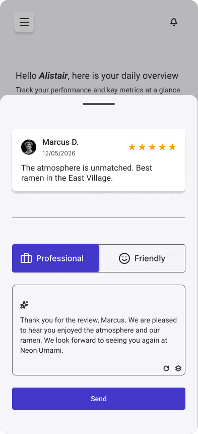
The response tool was confusing. The copy button was off-center, and the rewrite button sat too close to the main CTA, creating visual ambiguity. I regrouped all AI-related actions together, so users immediately understand what belongs to the tool and what triggers the final action.
Also The tone selector went from two separate buttons to a single switch. One interaction,
two options, zero decision fatigue.

Before Iteration

After Iteration
I ran a final A/B test with 4 participants split into two groups. Group A used the interface with two separate tone buttons. Group B started with the switch version. Two buttons carried equal visual weight, creating unnecessary friction in an already busy daily routine. The switch made the relationship between options immediately clear.
One participant said : "This feature is brilliant. I manage a restaurant and use a software called Silverware for daily operations. This functionality is missing from that tool."
3 out of 4
Users felt less confused when selecting a tone with the switch.

An MVP. With Room to Grow.
The goal was always focused: one core feature, one target market, one problem solved.
Restaurants and coffee shops first. 2500 users within 6 months of launch.
But the product was built to scale. Future features are already clear, connecting other review platforms, letting users choose their AI model between Claude, Gemini, Grok, or ChatGPT, bookmarking reviews for quick access.
And the market goes beyond food. Any business flooded with Google reviews has the same problem. The solution travels.
2,500users
within 6 Months
Contact
Let's work together
Contact
Let's work together
Every Restaurateur Has the Same Problem. Not Everyone Knows It Yet
Before designing anything, I needed to understand the landscape. Tools already existed. Partoo, Solocal, and Guest Suite all offer AI-powered review management. But they cover marketing, reputation, and business management all at once. Too much for one specific pain point.
AI removing friction, or just adding another tool to manage?
I sent a survey to 100 restaurants worldwide, 50 in France, 50 across Australia, the US, Canada, and the UK. Short, 5 questions, designed for busy people. The goal: understand if the problem was universal or culturally specific.
10
Respons survey
5
User interview
30 Minutes a Day. Not by Choice.
Out of the 100 surveyed, I conducted deep-dive interviews with 12 restaurant managers to extract qualitative data
The results were clear. On average, restaurateurs spend 30 minutes daily on review management. Not because they want to. Because they have to.
All 12 managers described it the same way: a chore, handled when tired or stressed. Negative reviews were often ignored out of guilt or to avoid
making things worse.
AI removing friction, or just adding another tool to manage?
I sent a survey to 100 restaurants worldwide, 50 in France, 50 across Australia, the US, Canada, and the UK. Short, 5 questions, designed for busy people. The goal: understand if the problem was universal or culturally specific.
30
Minutes daily
12
Managers described it
the same way
Was the Interface Intuitive Enough?
To save time early in the process, I used Figma Make to generate a first prototype and get a clear structural direction.
I then refined the UI manually, using it as inspiration rather than a final output. I also tested two different prompts with Gemini and Claude to push Figma Make further, but neither delivered the precision I needed. I went back to the traditional process.
The user test involved 8 participants who described the interface as clear, fluid, and simple.
Notably, one restaurant manager had ADHD; their seamless completion of every task without confusion served as the ultimate validation for clarity and low cognitive load.
The mobile version was the biggest concern. The response tool needed to fit a small screen without feeling cramped. I solved it with a bottom sheet that slides up, maximizing usability without
adding visual noise.
UX Validated. But How Do I Make It Effortless?
The response tool was confusing. The copy button was off-center, and the rewrite button sat too close to the main CTA, creating visual ambiguity. I regrouped all AI-related actions together, so users immediately understand what belongs to the tool and what triggers the final action.
Also The tone selector went from two separate buttons to a single switch. One interaction, two options, zero decision fatigue.
.
After Iteration
I ran a final A/B test with 4 participants split into two groups. Group A used the interface with two separate tone buttons. Group B started with the switch version. Two buttons carried equal visual weight, creating unnecessary friction in an already busy daily routine. The switch made the relationship between options immediately clear.
One participant said : "This feature is brilliant. I manage a restaurant and use a software called Silverware for daily operations. This functionality is missing from that tool."
3 out of 4
Users felt less confused when selecting a tone with the switch.
Before Iteration
An MVP. With Room to Grow.
The goal was always focused: one core feature, one target market, one problem solved.
Restaurants and coffee shops first. 2500 users within 6 months of launch.
But the product was built to scale. Future features are already clear connecting other review platforms, letting users choose their AI model between Claude, Gemini, Grok, or ChatGPT, bookmarking reviews for quick access.
And the market goes beyond food. Any business flooded with Google reviews has the same problem. The solution travels.
2,500users
within 6 Months