The Market Is Crowded. The Gap Is Clear
The biggest players all miss something. Anki buries vocabulary behind a confusing interface. Memrise goes deep but feels heavy. Duolingo leads the market but breaks immersion with ads. Babbel is clean but undervalues your level.
The pattern is consistent. No app combines atomic vocabulary learning, a modern UX, and an onboarding you can complete in seconds.
That's the gap. That's the product.
7 Users. Enough to Find the Real Problem.
The survey went out on HelloTalk, Twitter language exchange, and Discord. 5 questions. Short by design, built for people who are already busy learning.
The pattern was immediate. Users don't struggle to discover new words. They struggle to keep them. Notifications guilt-trip them. Gamification feels childish. Paywalls block the features that actually matter. And when a new word appears mid-conversation, they open notes not an app.
86%
Use Duolingo
5 and 10 minutes
Average session time.
4 out of 7
Are open to AI conversation, correction
and real personalization.
Less Noise. More Learning.
The product is built on four pillars. Instant word capture, no more opening Notes mid-conversation. Contextual practice, not just storing words, but using them. Spaced repetition, so nothing fades after a week. And a mature, calm design, no mascots, no guilt trips, no life bars.
The pattern is consistent. No app combines atomic vocabulary learning, a modern UX, and an onboarding you can complete in seconds.

Original mascot concept dropped.

User testing
The pattern is consistent. No app combines atomic vocabulary learning, a modern UX, and an onboarding you can complete in seconds.
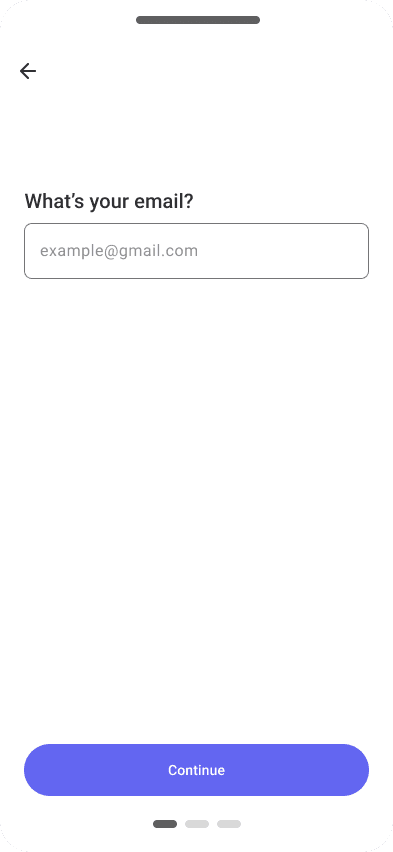


Green or Blue? Users Decided in Seconds.
After prototype validation, I ran an A/B test on 15 users to determine the final brand color, with one goal: reduce eye fatigue and increase session time.
Two versions. Green vs blue. 12 out of 15 chose blue. The green felt aggressive and triggered immediate associations: ecology or Duolingo. Neither fit the calm, mature positioning of the product.
Blue won. Not just as a preference, but as the right signal.


The Calm Alternative to a Noisy Market.
Short term: 5,000 users in 3 months. 5 minutes of learning per day on average. Targeting users frustrated by confusing interfaces and over-gamified apps.
Long term: become a reference in vocabulary learning within 2 years. Built on one conviction, calm design, real retention, and zero guilt.
The market is ready. The product is focused. The gap is real.
5,000
users in the first 3 months.
2 years
To become a reference in
vocabulary learning.
Contact
Let's work together
Koto 2026
Calm App in a Noisy Market.
A new language is rewarding. But choosing where to start is overwhelming.
Too many apps, too much content, too little clarity.
Vocabulary is the foundation. Yet no one wants to spend more than 30 minutes a day on it.
Contact
Let's work together
The Market Is Crowded.
The Gap Is Clear
The biggest players all miss something. Strike buries vocabulary behind a confusing interface. Memrise goes deep but feels heavy. Duolingo leads the market but breaks immersion with ads. Babbel is clean but undervalues your level.
The pattern is consistent. No app combines atomic vocabulary learning, a modern UX, and an onboarding you can complete in seconds.
That's the gap. That's the product.
7 Users. Enough to Find the Real Problem.
The survey went out on HelloTalk, Twitter language exchange, and Discord. 5 questions. Short by design, built for people who are already busy learning.
The pattern was immediate. Users don't struggle to discover new words. They struggle to keep them. Notifications guilt-trip them. Gamification feels childish. Paywalls block the features that actually matter. And when a new word appears mid-conversation, they open notes not an app.
86%
use Duolingo
5 and 10 minutes
average time setion.
4 out of 7
are open to AI Conversation, correction
and real personalization
Less Noise. More Learning.
The product is built on four pillars. Instant word capture, no more opening Notes mid-conversation. Contextual practice, not just storing words, but using them. Spaced repetition, so nothing fades after a week. And a mature, calm design, no mascots, no guilt trips, no life bars.
The pattern is consistent. No app combines atomic vocabulary learning, a modern UX, and an onboarding you can complete in seconds.
User testing
The pattern is consistent. No app combines atomic vocabulary learning, a modern UX, and an onboarding you can complete in seconds.
Green or Blue?
Users Decided in Seconds.
After prototype validation, I ran an A/B test on 15 users to determine the final brand color, with one goal: reduce eye fatigue and increase session time.
Two versions. Green vs blue. 12 out of 15 chose blue. The green felt aggressive and triggered immediate associations, ecology or Duolingo. Neither fit the calm, mature positioning of the product.
Blue won. Not just as a preference, but as the right signal.
The Calm Alternative
to a Noisy Market.
Short term: 5,000 users in 3 months. 5 minutes of learning per day on average. Targeting users frustrated by confusing interfaces and over-gamified apps.
Long term: become a reference in vocabulary learning within 2 years. Built on one conviction, calm design, real retention, and zero guilt.
The market is ready. The product is focused. The gap is real.
5,000
users in the first 3 months.
2 years
To become a reference in
vocabulary learning