Kumori 2026

Live, but driving users away

Live, but driving users away

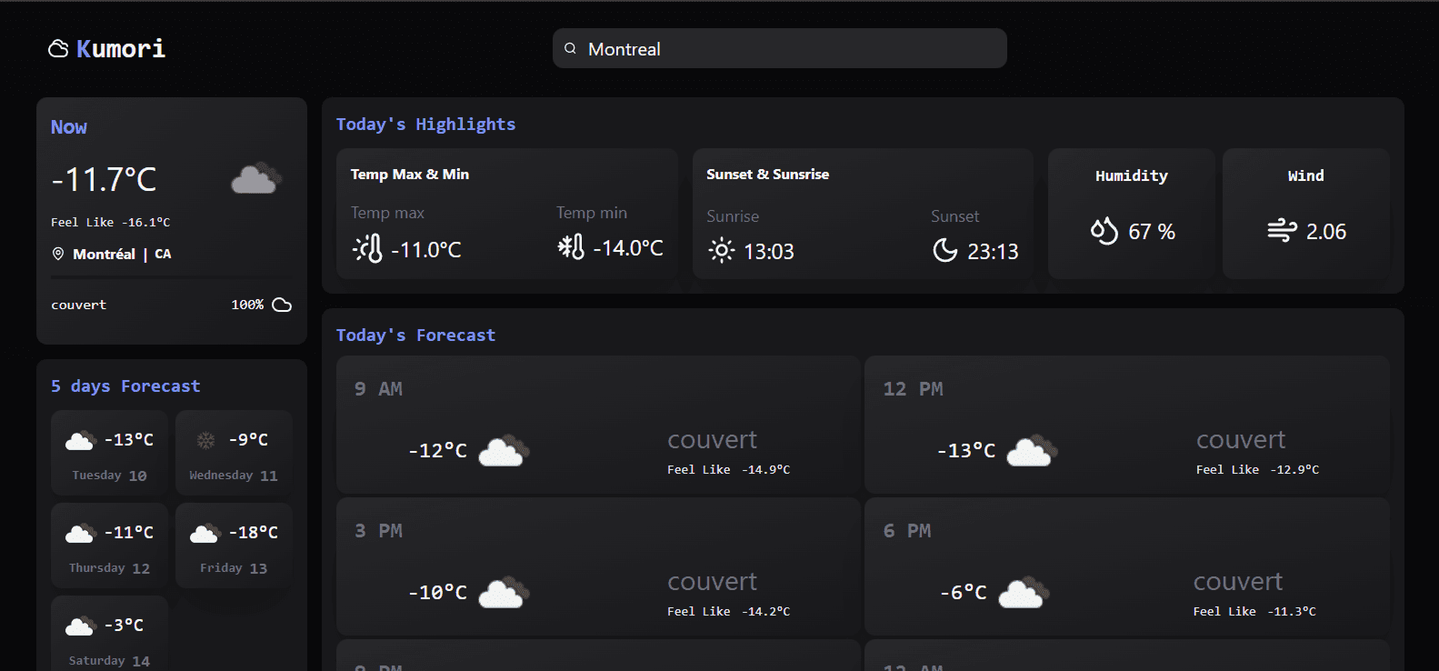
Two years ago I shipped Kumori as a developer, no design background, no user research. Just code. The numbers were brutal: 8 monthly visits and a 1-minute average session.

I came back as a product designer. Same product, different lens.

1 min

Average user session

8

Monthly visits

Expected impact

Expected impact

3 min

Average user session

Average user session

20

Monthly visit

Monthly visit

A Weather App That Couldn't Communicate the Weather: What Went Wrong?

A Weather App That Couldn't Communicate the Weather: What Went Wrong?

The first look was enough. No clear hierarchy, no reading flow. A mix of French and English across the same interface. Colors that technically passed accessibility, but barely, and without intention.

The first look was enough. No clear hierarchy, no reading flow. A mix of French and English across the same interface. Colors that technically passed accessibility, but barely, and without intention.

Which data does the dashboard needs?

Which data does the dashboard needs?

Before touching anything, I researched what a weather dashboard actually needs to deliver: current conditions, hourly forecast, wind, humidity, sunrise and sunset and UV index. The existing version had the data. It just didn't communica.

Before touching anything, I researched what a weather dashboard actually needs to deliver: current conditions, hourly forecast, wind, humidity, sunrise and sunset and UV index. The existing version had the data. It just didn't communica.

From Wireframe to Real Insights: What Users Actually Needed

From Wireframe to Real Insights: What Users Actually Needed

The first decision was navigation. Icons only, or icons with labels? For a weather dashboard, a sun icon could mean forecast, UV index, or current conditions. Ambiguity creates friction. I chose labels before even testing, to avoid wasting user testing time on a confusion I had already identified.

The first decision was navigation. Icons only, or icons with labels? For a weather dashboard, a sun icon could mean forecast, UV index, or current conditions. Ambiguity creates friction. I chose labels before even testing, to avoid wasting user testing time on a confusion I had already identified.

Usability testing

Usability testing

The usability test confirmed the direction. 8 participants, aged 24 to 29. The login flow worked. Information was findable. But two pain points surfaced.


The favorite icon wasn't misplaced, it was too small to be noticed. Wind data shown as a percentage created unnecessary confusion, users naturally expected km/h to understand speed.


Design decision

One question required its own research. Star or heart for favorites? I ran a social media poll, 15 responses. 13 chose the star. The reason was unanimous: habit. The web has conditioned users to associate stars with saving.

The usability test confirmed the direction. 8 participants, aged 24 to 29. The login flow worked. Information was findable. But two pain points surfaced.


The favorite icon wasn't misplaced, it was too small to be noticed. Wind data shown as a percentage created unnecessary confusion, users naturally expected km/h to understand speed.

Design decision

One question required its own research. Star or heart for favorites? I ran a social media poll, 15 responses. 13 chose the star. The reason was unanimous: habit. The web has conditioned users to associate stars with saving.

Design with Technical Constraints: Bridging Figma and Code

Design with Technical Constraints: Bridging Figma and Code

The visual exploration started broad. I tested gradients across two directions, orange and blue, alongside different icon sets.

But I landed on coral. Not purely for aesthetics. OpenWeather API icons are coral by default. Aligning the color system with the API output turned a technical constraint into a design advantage: a unified interface where the accent color naturally directs the user's eye toward the most important data.

The visual exploration started broad. I tested gradients across two directions, orange and blue, alongside different icon sets.

But I landed on coral. Not purely for aesthetics. OpenWeather API icons are coral by default. Aligning the color system with the API output turned a technical constraint into a design advantage: a unified interface where the accent color naturally directs the user's eye toward the most important data.

From there, I used V0 to rapidly prototype the dashboard directly from my Figma file. Not to skip the work, but to validate technical feasibility quickly and get a real, functional product in front of users. V0 compressed the time between design decision and real-world feedback.

From there, I used V0 to rapidly prototype the dashboard directly from my Figma file. Not to skip the work, but to validate technical feasibility quickly and get a real, functional product in front of users. V0 compressed the time between design decision and real-world feedback.

From Wireframe to Real Insights: What Users Actually Needed

8

Participants

2

Groups
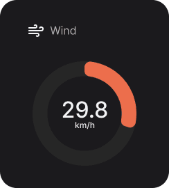
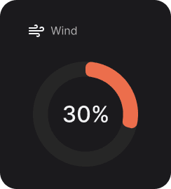
Group A tested the V0 prototype first, wind displayed as a percentage. Group B started with the Figma prototype, wind displayed in km/h. Both groups then switched to the other version.
The task was simple: read and communicate the wind value.

Group A tested the V0 prototype first, wind displayed as a percentage. Group B started with the Figma prototype, wind displayed in km/h. Both groups then switched to the other version.
The task was simple: read and communicate the wind value.

Design decision

Design decision

Users instinctively associate percentage with humidity, not wind. It created confusion and frustration.

Version B was kept. 8 out of 8 users expected wind speed in km/h. Not a preference, a standard.

Kumori 2.0: What Two Years and Real Users Changed

After rebuilding the interface, the first milestone is clear. Session time should move from 1 to 2 minutes within the first month, before reaching the 3-minute target. 10 additional visits expected in the same period.


The best results didn't come from time spent in a design tool or a code editor. They came from time spent with users. Understanding the market, talking to real people, researching ideas, prototyping, testing, and iterating that is where the product was actually built.

+2

min Screentime

+10

Visits expected

Contact

Let's work together

Contact

Let's work together

Create a free website with Framer, the website builder loved by startups, designers and agencies.